Features / Architecture Diagramming
Architecture Diagramming & Visualization
Architecture diagrams are how architects communicate — but static diagrams in Visio or PowerPoint go stale the moment you save them. They show what someone thought the architecture looked like, not what it actually is.
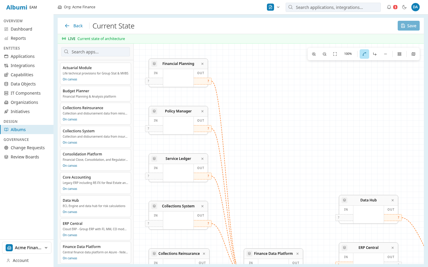
Albumi generates diagrams from live data. Every node is a real application, every edge is a real integration. When you add a new integration or decommission an application, the diagrams update automatically. No more "is this diagram still accurate?"
What You Can Do
Integration Map
A visual map of all application connections in your landscape. See which systems talk to each other, through which integrations, and via which protocols. Filter by organization, lifecycle status, or technology to focus on what matters.
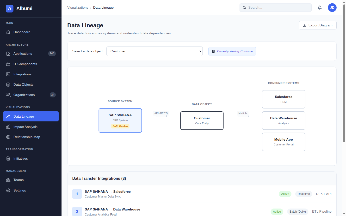
Data Lineage Graph
Follow any data object from its System of Record through every integration to every consuming application. A visual graph that makes data flows tangible — perfect for compliance conversations and migration planning.
Dependency Graph
Select any application and see its full dependency tree — upstream systems it depends on, downstream systems that depend on it, and the integrations connecting them all. The foundation of every impact analysis conversation.
Example: Architecture Review Meeting
Your architecture board meets monthly to review proposed changes. Instead of someone spending 2 days updating PowerPoint diagrams, you open Albumi and show the live integration map. "Here's our current landscape. Here are the 3 applications marked for phase-out. Here's what the dependency graph looks like for each one."
The board makes decisions based on real data, not last month's approximation. And when someone asks "what about the connection to the billing system?" — you click it and show them, instead of saying "I'll check and get back to you."
Works Together With
Integration Catalog
Diagrams are generated from your integration catalog — every edge on the map is a real integration.
Data Lineage
Visualize data flows from source to consumer with the data lineage graph.
Impact Analysis
The dependency graph powers visual impact analysis — see affected systems at a glance.
Architecture Diagrams That Stay Current
Sign up for early access and see your architecture visualized from live data.
Get Early Access